These two brands target the same demographic, in the same city, and are remarkably similar – which would normally be a serious brand differentiation faux pas – but I suspect that their target audience are probably likely to buy equally from both brands. And they’re just so beautiful that you have to forgive them. It might just be a rare exception to the golden rule of the need for brands to look visually different and distinctive – they probably get away with it because they’re utterly gorgeous and because they are both faithful to the quality of their brands.
First the Opera, and then the Orchestra, including some behind-the-scenes videos…
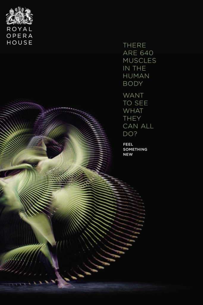
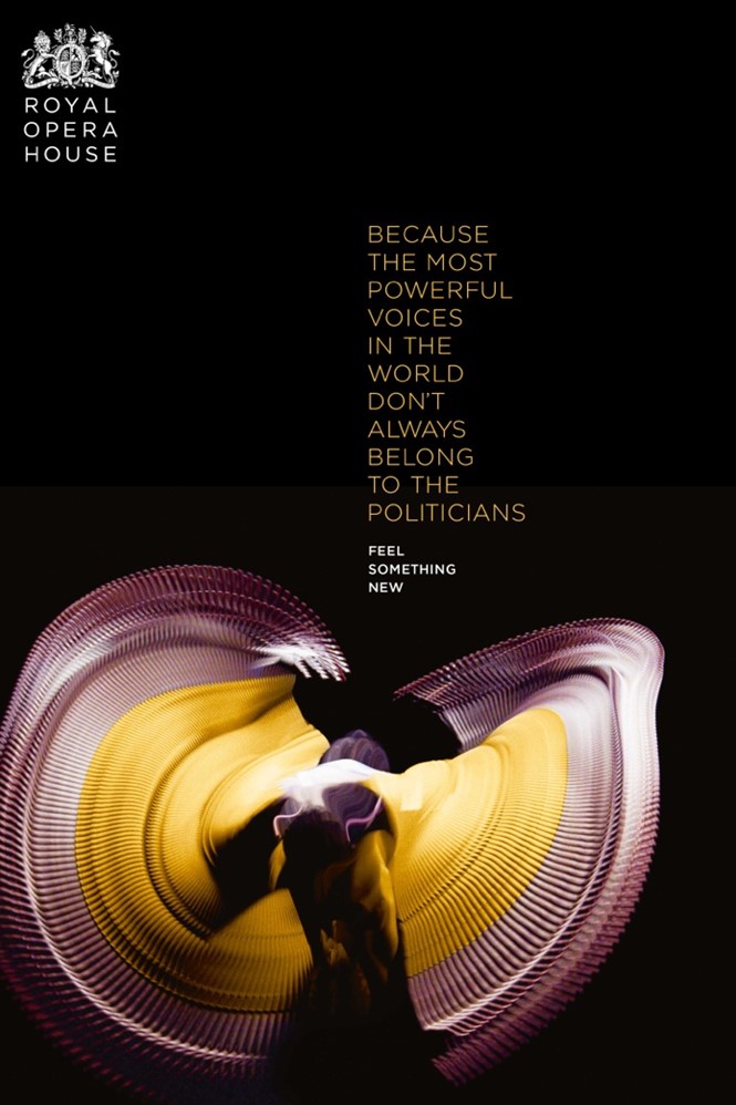
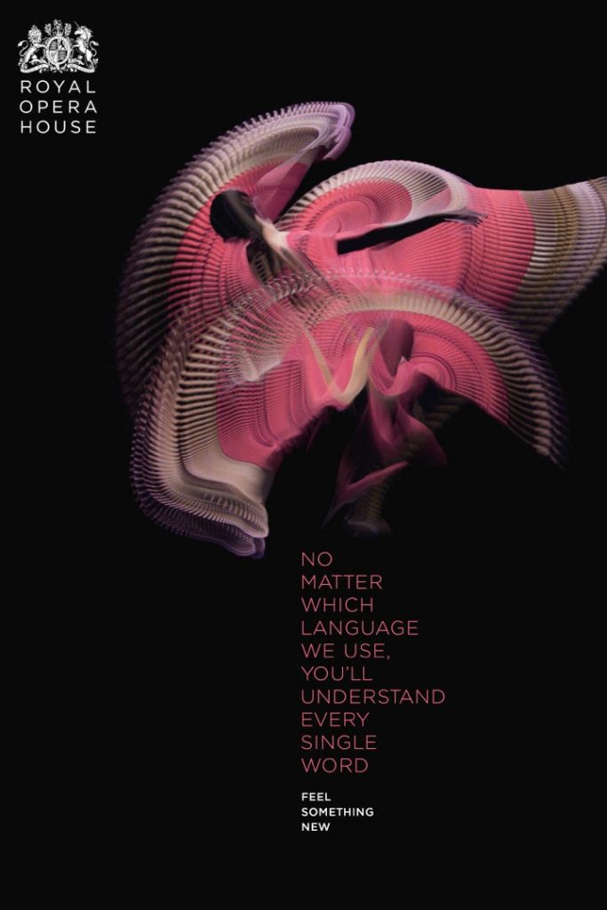
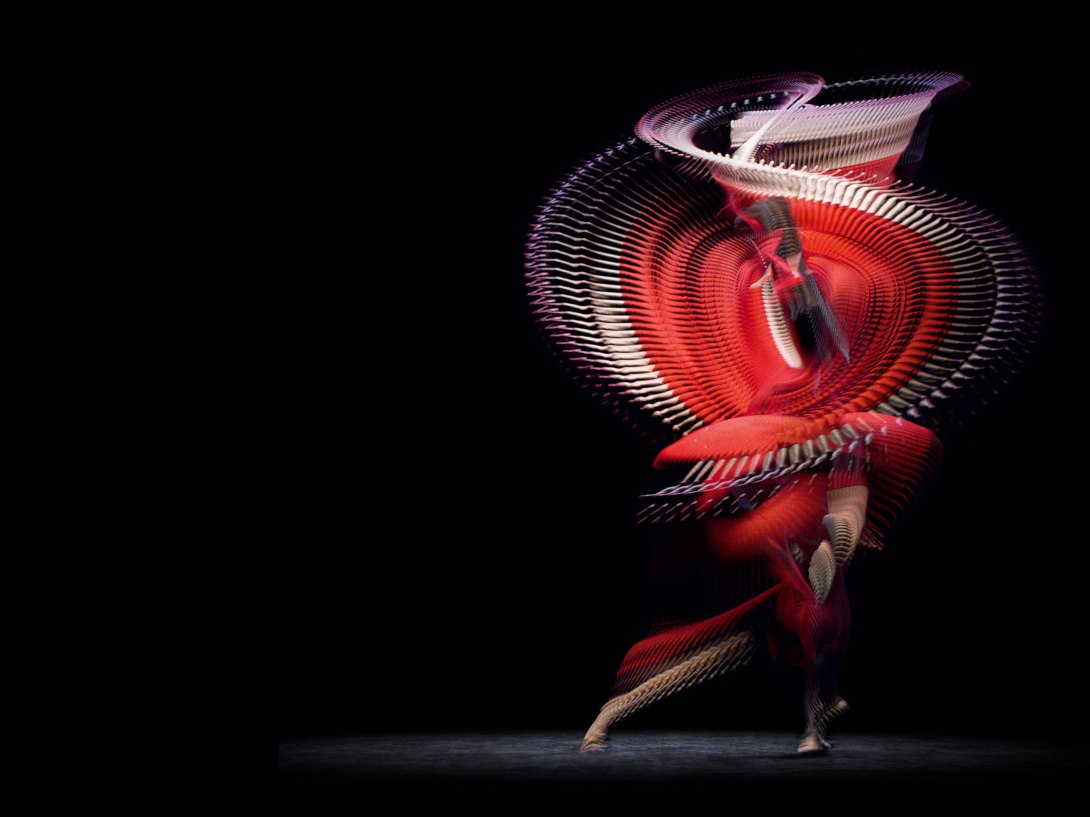
Royal Opera House, London
This mesmerising work, which was unmissable in Covent Garden earlier this year, features time-lapse imagery of performers… (the copywriting is brilliant too)…
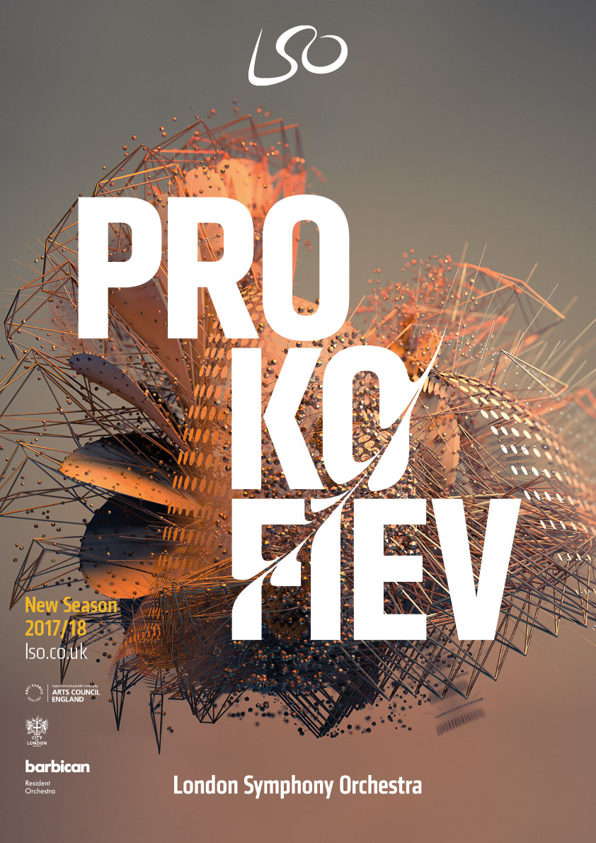
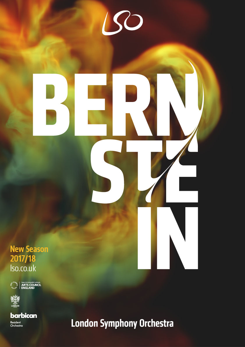
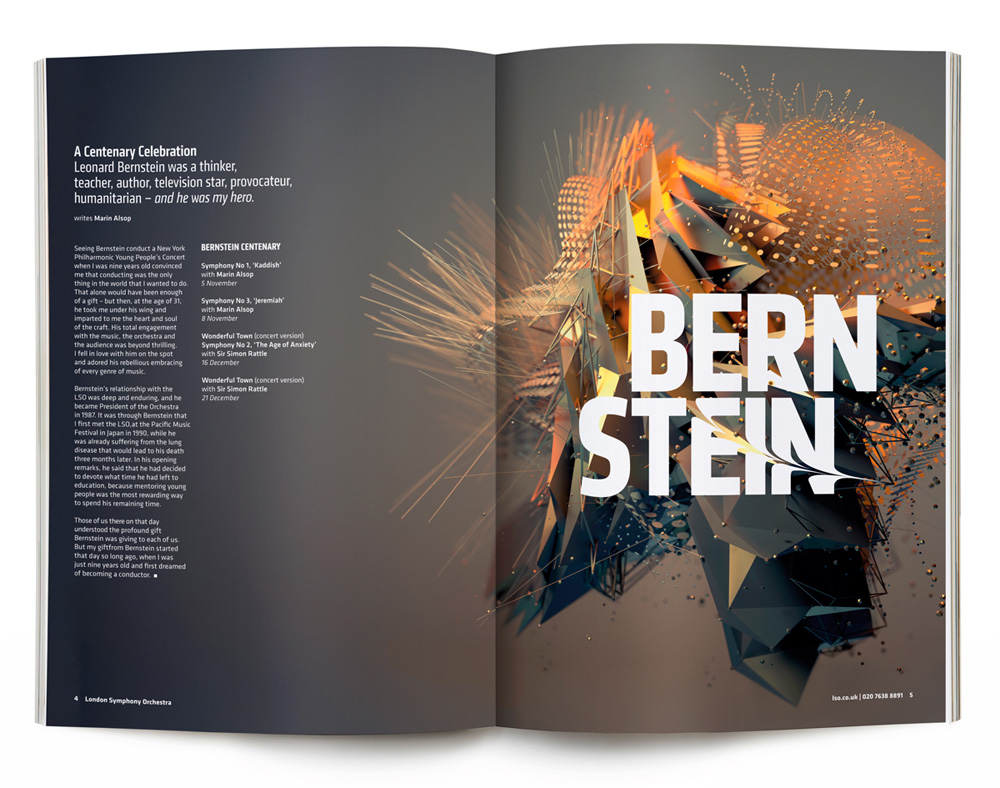
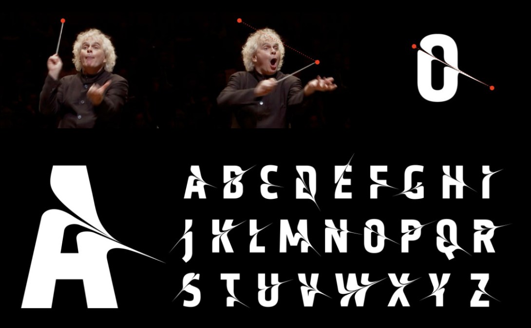
London Symphony Orchestra
This brand (which was brought to my attention by the guys over at New York agency Vector) uses patterns inspired by the music played by the orchestra, but also (and quite ingeniously) based upon the motion of the conductor’s baton. Check out the video below…